
Creating new UX copy for Azazie’s dress try-on program
Say yes to the dress! I revamped a problematic step-by-step guide on how Azazie’s at-home dress try-on process works while keeping it straightforward and user friendly.

IDENTIFYING THE PROBLEM
At Azazie, I was tasked with updating a step-by-step guide on how to progress through the At-Home Dress Try-On Program that they were revamping at the time. I’m now looking at the larger scope of the project and thinking of what processes could be improved from start to finish.
Amidst the worries of an ongoing pandemic, users are more likely to shop online for a bridesmaid or special occasion dress. Many don’t feel 100% comfortable shopping and trying on dresses in store just yet, but found Azazie’s at-home try-on program as a promising option.
I didn’t have access to any of the specific reasons as to why the UX copy needed a refresh, but I can hypothesize that the following may have occurred:
A high amount of complaints or inquiries to customer service asking for clarification on how the program works
Miscommunication on timelines from receiving to sending back the dresses leading to unwanted charges from delayed returns
Customers inquiring as to whether the cost would go towards the cost of the final dress purchase or if they needed to pay extra for return shipping
CUSTOMER PERSONA
NAME: Natalie
QUOTE: “As a bridesmaid in my friend’s wedding, I’m in the market for a formal dress. I’m not sure what'll look best on me though.”
BACKGROUND: Woman in her 20s to 30s, high school graduate and/or college educated, living in the USA
USER ENVIRONMENT: Shopping from the website on web or mobile
PAIN POINTS: She’s overwhelmed by the amount of styles, silhouettes, and options and the possible cost of buying a dress online and having it not fit, look good, or a variety of other reasons. She’s also confused by the instructions on how the program works, so she’s hesitant to use a virtual program like Azazie’s.
It’s not communicated clearly if the dress fee is going towards the cost of the final dress, if she has to pay an additional fee for returns, and how to process a return, so she reaches out to customer service for more clarification.
USER GOALS: Natalie wants to easily find and try on bridesmaids dresses from the comfort of her home so she feels comfortable and beautiful at the wedding.
COMPANY GOALS: The goal is to get customers with the same needs as Natalie into the At-Home Dress Try-On program. Ideally, they’d choose their dress selects, return the ones they don’t like, repeat the process as few times as possible, and have them select and purchase a dress from the website as a result.
POSSIBLE SOLUTIONS
I really only had say over the copy in the FAQ, but this is how I would try to solve the user’s pain points throughout the whole at-home try-on process.
Overall, I would remind the user from start to finish of how the process works and where they are in the process.
1) In the package, include a physical pamphlet of the steps the user needs to take to complete the return.
2) Automatically send an email to them stating exactly when the return period starts and ends when the package tracking says “delivered”.
3) In that email, link to a FAQ with more detailed instructions on what they need to do or not do to avoid getting charged a late fee or a restocking fee. If the user has more questions that were not addressed by the physical pamphlet or the FAQ, make the customer service email clear to them.
4) In the FAQ, there would be clear, straightforward instructions written in plain language on any potentially confusing situations that the user might find themselves in.
5) Make the returns process easy by allowing the user to generate their own pre-paid label by inputting their order number. They’d then select which items they’d like to return and the reasons why they’re returning it.
6) Make instructions clear on which shipping carrier the user needs to drop off the package to to avoid the package getting lost in transit.
7) When the company receives the return, another automated email should deploy letting the user know that the return has arrived and is awaiting processing and approval, depending on the condition the items were returned in.
8) When the return finishes processing, the user should receive another email saying the return process is complete, and detailing any charges that may have incurred due to damage, with photos attached of said damage.
ANALYSIS OF A SIMILAR PROGRAM
A successful at-home trial model would be snif’s, where they have a 7-day trial where you can test the included sample they send, and if you don’t love it, you can send it back for no charge if the original packaging is not tampered with.
You can see the overview of their trial program here and view their FAQ here. Below are screenshots of the emails snif sent throughout the order process to keep the user informed.


WHAT WE ENDED UP DOING
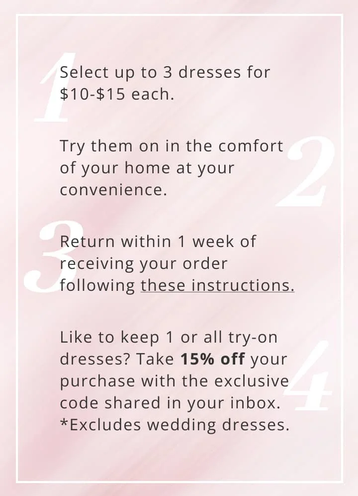
I personally didn’t get to touch anything aside from the FAQ copy and the banner on the at-home try-on page, but the UX copy that I wrote can be seen in the graphics below.
I went for an upbeat but still informative tone to match the brand voice, but ultimately prioritized presenting information in plain language.
I believe that in the FAQ, I addressed a lot of the previous questions that users had about the program including cost, shipping, and any parameters like the countries that the program is eligible to ship to.


I do wish that I had a chance to suggest other solutions and speak on my hypothesis on other reasons users weren’t fully satisfied with the at-home try-on program.
I was also very siloed off from any other teams (or really anyone from the company in general), as I was a freelancer working remotely for the first time during the pandemic. I didn’t get to speak to any of the stakeholders in the process which could include graphic designers, data and analytics, email marketing strategists, the product team, and possibly a sourcing team and software engineers.
THE (DESIRED) RESULTS
I also did not have access to the results of this UX update, but if I did have access to metrics, I would be looking at the following things:
Reduced frequency of inquiries to customer service about the at-home try-on process
Lower amount of late returns leading to unwanted charges
Higher frequency of returns arriving in usable, sellable condition (all tags attached, no stains or rips, like new condition)
Reduced rate of cart abandonment with styles from the at-home try-on selection
IN CONCLUSION…
Especially in a world that is still recovering from a pandemic, people are starting to see the value of at-home programs. I think that investing more time into the process to make the user’s experience better is worthwhile, especially since there is only a single Azazie brick & mortar location… in Arkansas.
Putting more time and resources into improving the at-home program from start to finish would make the brand have more equal footing in comparison to other bridal-focused stores that have better retail presences.
If I wanted to see how the try-on program as a whole could be improved, I would look to these metrics to see how to proceed next from a UX perspective:
How many times people went through the at-home try-on process consecutively
A higher average could be telling of another UX-related issue, likely relating to inaccurate or lack of information on the product copy page.
The reasons for sending a dress back from the at-home try-on program
If certain styles have a consistently high return rate, that could be a reason to take a look at the design of the style itself to see why people may be dissatisfied, or to discontinue the style completely.
I’m not working with the brand anymore, but if I were, I’d urge the product, e-commerce, and buying team to collectively spend more time thinking about how they can make the at-home program better, especially with special events ramping up post-COVID.
Overall, I am happy with the user-centered writing that I did for this project and am proud of what I was able to do in a short time frame!